

Varick Bizot
Graphic Designer
I enjoy shaping ideas into visual stories through thoughtful design, typography and attention to detail.
Selected Work

The Road
book redesign & binding
Stepping Outside Adobe
commitment to change
Welcome Banner
outdoor teardrop banner


A Little About Me
Growing up in the South Pacific islands, my journey has taken me across oceans and cultures, from the islands of the South Pacific to France and the UK.Experiencing different places and ways of life has shaped how I see the world, influencing my curiosity about people, places and the stories they carry. I bring that perspective into my creative work, paying attention to the details that give an idea its character.
Got a Project in Mind?
Reach out and I'll get back to you as soon as I can, so we can start the conversation.
My Projects
Slow, steady and intentional, in life and in design.

WELCOMING INTERNATIONALS
Teardrop Banner
THE FORBIDDEN TYPE
Typography
STEPPING OUTSIDE ADOBE
Commitment To Change
THE ROAD
Book Redesign & Binding
MON CLUB
Mobile App, POS & Catalog Design
COMING SOON!
Where Surf & Pub Meet
COMING SOON!
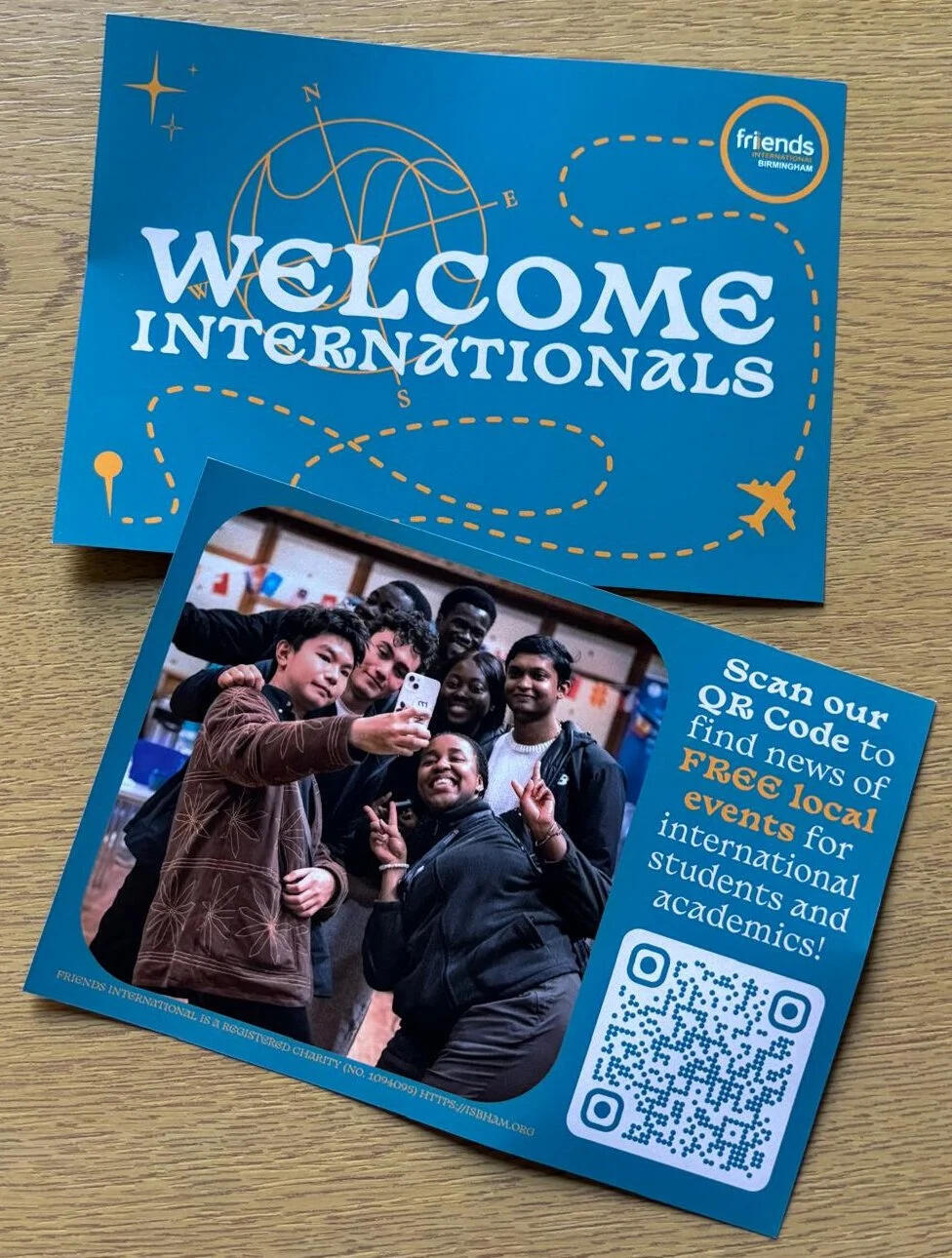
Flyering To Internationals




Welcome Banner
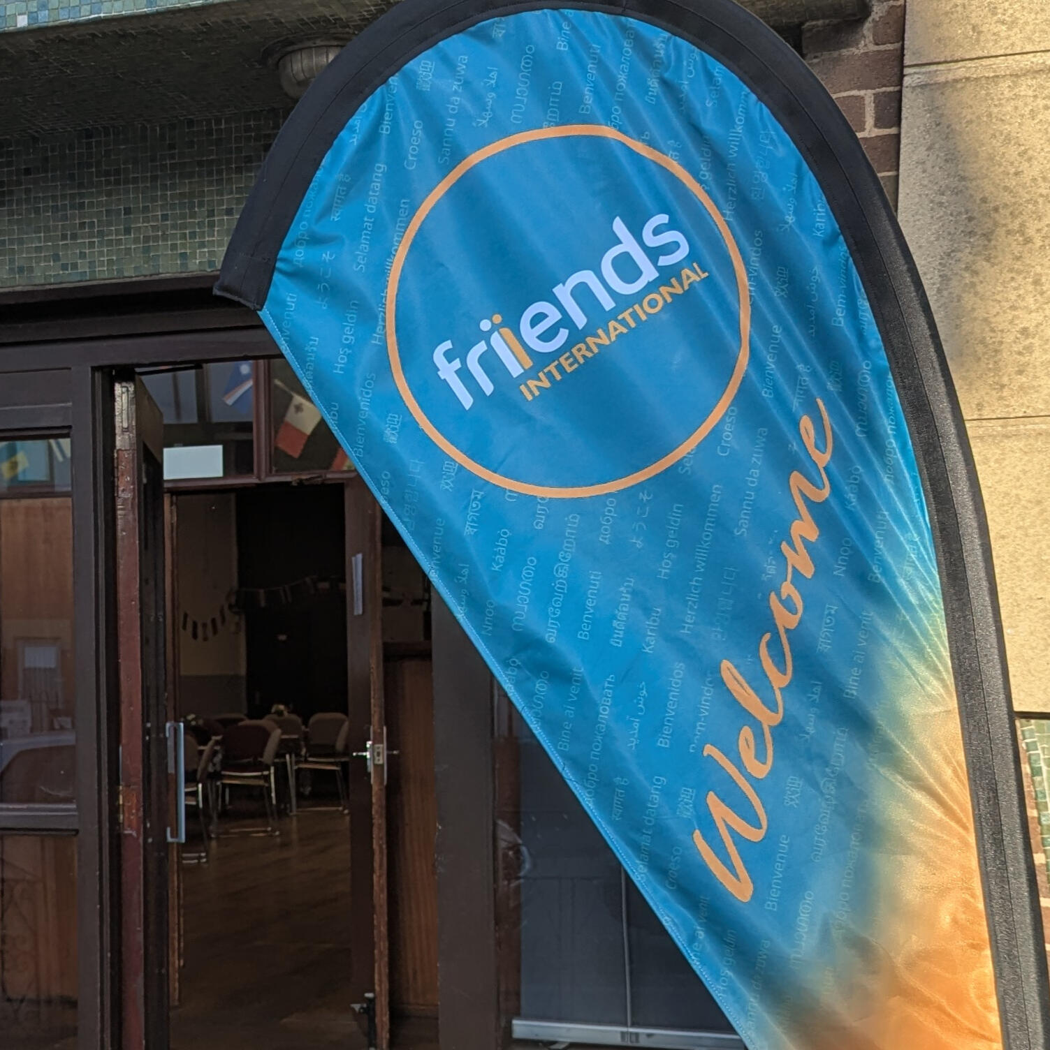
Friends International needed a new outdoor banner for events welcoming international students. The previous rectangular design had begun to look dated and was difficult to keep visible in the UK's unpredictable wind and rain.Shape and readability
I developed a teardrop-shaped design to help the wind move around the banner, reducing the amount it flapped and helping keep the message visible outdoors.Typography across languages
The background features the word "Welcome" repeated in dozens of languages, with English as the main focal point. I recommended Google's Noto font family for the translations to provide support across different writing systems, including Arabic, Mandarin and Hindi, while keeping the smaller text consistent.Color with meaning
The gradient moves from warm orange at the base into the brand teal. I chose the orange to represent the hospitality, friendship and sense of belonging that Friends International hopes to offer, leading into the more expansive teal.With the budget allowing for just one print run, the double-sided layout needed careful attention before going to print. When the banner finally arrived, it was rewarding to see the design become something tangible. The client was proud of the result, and I was pleased to see everything come together as intended. I enjoy seeing a design move beyond the screen and take its place in the real world.A note on the final print: The printed banner differs slightly from the original mockup, with the gradient and welcome message appearing in the opposite orientation. This was a production variation from the approved design.


The Forbidden Type
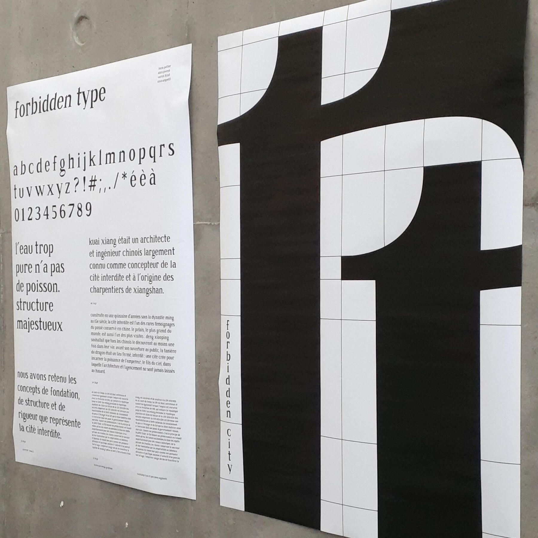
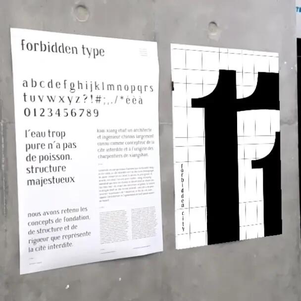
Created during a four-day team sprint, this project challenged our team of three to design a custom typeface inspired by iconic architecture. Wanting to explore somewhere beyond Europe, I suggested the Forbidden City in Beijing, China, designed by Kuai Xiang. The idea was well received, and we began looking at the architectural details that could influence our letterforms.As a team, we decided to draw inspiration from two defining features of the palace complex: its foundations and distinctive rooftops. These became the starting point for developing the typeface, with each of us contributing to different parts of the process.We began by sketching the letters by hand before scanning and refining them digitally in FontLab and Glyph. I worked alongside another team member on developing the digital typeface, while they focused on spacing and consistency. Our third team member concentrated on the initial lettering and later created the specimen poster.The font is available to download for personal use. Given the four-day timeframe and some technical export limitations, a few glyphs are missing from the final file, but most of the character set is ready to explore.Working on this project gave me a new appreciation for the craft of type design and sparked an interest I'd love to explore further. I'd like to create more typefaces of my own in the future, continuing to experiment with the relationship between form, structure and typography.To bring the typeface to life, I also created a looping animation featuring the letter "n" in After Effects. We integrated this with Artivive, allowing viewers to experience the animated letter through augmented reality.


Stepping Outside Adobe
I wanted to see how much of my usual design workflow I could move away from Adobe, so I created a newsletter banner using Affinity and After Effects. The experiment was also shaped by a wider interest in digital privacy, artists' rights and having more choice over the tools I use.I created the banner artwork in Affinity. Getting used to different tools and keyboard shortcuts took some adjustment, but I found Affinity's vector tools capable of handling the design.I then brought the artwork into After Effects to create a smooth, looping wave transition. Although I was still using Adobe for the animation, the project helped me understand where Affinity could take the place of my usual tools and where I still had more to explore. It also confirmed my decision to make Affinity my primary design suite.


The Road
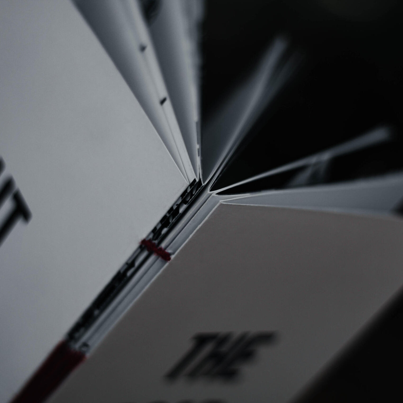
I've never been much of a reader, although that's something I've gradually come to appreciate more over time. When I read The Road by Cormac McCarthy, I found myself drawn not only to its story, but to the opportunity to explore how its words could be experienced visually.This personal project began with the work of French graphic designer and typographer Robert Massin, particularly his book design for The Bald Soprano. I was fascinated by the way he used typography and silhouettes to give the actors' dialogue a visual presence, reflecting their voices, pacing and personalities. I wanted to explore a similar approach with The Road, bringing its dialogue to life through typography and illustration.Rather than redesigning the entire book, I selected key moments from the story and focused on the dialogue between the characters in the book. I used two typefaces to distinguish their voices, experimenting with scale, arrangement and shadows to give the words a sense of movement and expression. The illustrations were developed alongside the typography, allowing the two to work together rather than treating the text as something separate.A world without color
The book's black and white palette reflects the bleak, colorless world described in the story: an apocalyptic landscape where much of what once made life beautiful has disappeared. Against this darkness, I introduced a subtle red thread into the bookbinding. This detail was inspired by a small but meaningful moment in the story, when the father introduces his son to the simple joy of a can of Coca-Cola. Its red color becomes a reminder of a world that once existed, and of the small things that can still bring happiness. I wanted that red to run through the book as a symbol of the bond between father and son, a thread connecting their journey and holding their story together.Tracing their journey
Alongside the book, I created a map illustrating the route taken by the father and son across the eastern United States. Based on my interpretation of the locations described in the story, it offers another way to follow their journey from one place to another.Spanning ten months, this was a project I particularly enjoyed developing. It gave me the opportunity to explore the relationship between typography, illustration and storytelling in a much more personal way. I'd love to continue exploring book design, whether by developing this project further or creating something entirely new.


Mon Club
While working at GBH in New Caledonia, I was involved in the launch of Mon Club, a mobile app designed to replace traditional physical loyalty cards across participating retailers. My work covered several parts of the launch, from in-app promotional visuals to in-store displays and checkout screens.For the app, I created campaign visuals and digital catalogue layouts, making sure promotional content and product details were accurate. The app allowed customers to browse weekly offers and keep track of the reward points they collected while shopping.I also designed point-of-sale (POS) displays for high-traffic areas and checkout spaces, helping bring the app's promotions into the physical shopping environment.Alongside this, I redesigned the customer-facing screens on checkout systems and created a looping GIF highlighting the app's loyalty benefits and encouraging shoppers to download it.


Beyond The Work
Slow, steady and intentional, in life and in design.

I'm Varick, a graphic designer who grew up in the islands of Oceania. My journey has taken me across oceans and cultures, from the South Pacific to France and the UK, where I studied multimedia and communication before focusing on graphic design.I'm drawn to typography, visual storytelling and the details that give an idea its character. Experiencing different places and ways of life has shaped how I see the world, while time outdoors helps me stay curious and notice the details around me.I like to work at a steady, considered pace, exploring possibilities, refining ideas and finding thoughtful ways to bring them to life. I value listening, learning from different perspectives and discovering what makes people, places and ideas distinct. This curiosity and attentiveness are things I try to bring into my creative work.And I'm always interested in exploring new creative possibilities across different mediums, from still imagery to motion and video.
Where To Next?
I hope this gives you a little insight into the person behind the work.
You're welcome to take a look at some of my work to see how these ideas take shape, or get in touch if you'd like to work together.
A Conversation Starts Somewhere
Have an idea you'd like to explore, a project in mind, or simply want to say hello?
I'd be glad to hear from you.
Email me at